ENTERPRISE SAAS · WEB + MOBILE
Redesigning Visitor Pre-registration
My role
Lead Product Designer
Timeline
2023 - 2024
Scope
End-to-end redesign · Web + iOS + Android
What changed
Redesigned the web experience, extended key flows to mobile, and added reusable components to the wider design system.


CONTEXT
A core visitor-management workflow
MRI OnLocation helps organisations manage visitors, employees and contractors across workplaces. Visitor pre-registration allows employees to invite visitors before they arrive and manage upcoming visits. I led the redesign across web, iOS and Android, working with Product and Engineering.
PROBLEM
A fragmented workflow made pre-registration harder
The existing pre-registration journey was spread across multiple entry points and modules. Employees had to create an event before adding visitors, move between separate workflows to complete visitor and compliance details, then return to the visitor list to manage invitations and follow-up actions.
KEY ISSUE 01
Fragmented workflow
Registration was spread across multiple screens, entry points and modules.
KEY ISSUE 02
Unclear starting point
Overlapping options made it difficult for employees to know where to begin.
KEY ISSUE 03
Inconsistent interactions
Similar tasks behaved differently across the product, making the experience harder to learn and use.
KEY ISSUE 04
Incomplete registrations
Events could be created without adding visitors, leaving registrations unfinished.

Legacy screens showing the fragmented workflows and inconsistent patterns before the redesign.
RESEARCH
Understanding where the journey was breaking down
I reviewed the existing pre-registration experience through workshops, journey mapping, product architecture analysis and a UX audit. This helped me identify where users were getting stuck, how the workflow had become fragmented and what needed to be prioritised for the redesign.
Aligning customer, business and technical needs
I facilitated a workshop with Product, Engineering and Support to bring together customer needs, business goals, support insights and technical constraints. This helped the team agree on the priorities for the redesign.

Mapping the end-to-end pre-registration journey
I mapped the journey from entry point to follow-up to see where users moved between workflows, repeated steps and lost clarity. This highlighted the biggest friction points and where the experience could be simplified.

Mapping the product structure
I mapped the existing product structure to understand how entry points, visitor records and pre-visit requirements were spread across different modules. This showed how the product structure was contributing to the fragmented journey.

Auditing the existing experience
I reviewed the key screens against usability heuristics to identify recurring issues across navigation, workflows, guidance and interaction patterns.

What we prioritised
The research gave me four clear priorities that shaped the redesign.
01
Connect the registration flow
Bring related steps into one journey and reduce switching between modules.
02
Make the next step clear
Show users what they need to do, what is missing and how to continue.
03
Improve information hierarchy
Group and order information so forms and key actions are easier to scan.
04
Make interactions consistent
Use consistent patterns and reusable components across the experience.
SOLUTION
Reimagining the experience within existing constraints
The product used an existing Bootstrap-based framework, so I redesigned the experience within those technical constraints. I focused on simpler workflows, clearer hierarchy and more consistent patterns across web, iOS and Android.
Creating a clearer entry point
I redesigned the pre-registration screen with a new empty state, clearer actions and one entry point for individual and group registrations. This made it easier to understand where to start.

Bringing registration into one form
I brought visitor details, visit information, agreements and questionnaires into one structured form. Advanced scheduling options appeared only when needed, keeping the default experience simpler.


Bringing group registration into one flow
I created a dedicated group-registration flow that combined event setup and visitor management in one place. Users could add new or saved visitors, import lists and manage attendees without switching between screens.
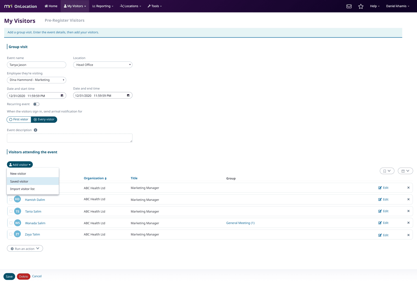
Adding saved visitors and groups without leaving the flow
- I introduced a reusable selection dialog that let users search, select and add saved visitors or groups without leaving the registration flow.

Making the visitor list easier to scan and manage
I redesigned the visitor list with clearer filters, status indicators and contextual actions. Secondary actions were grouped into menus to keep the table easy to scan, while supporting both individual and bulk actions.

Making visitor messages easier to track
I simplified sending OnPasses and questionnaires, making it clear what had been sent, what still needed action and when each message was last sent.

Bringing visitor details into one place
I designed a review modal that brought together visit information, contact details, questionnaire responses and agreements in one place. For group registrations, warning indicators highlighted visitors with missing information or actions required before sign-in.


Pre-registering visitors from calendar invites
I created a step-by-step guide showing employees how to pre-register visitors from Outlook or Google Calendar, avoiding the need to enter the same visit details twice.

Extending the experience to mobile
I extended visitor registration and management to iOS and Android, keeping the experience consistent with web while adapting it for mobile.
Pre-registering visitors on mobile
I carried the web empty-state pattern into mobile and designed a simple registration flow where users could add visitor details, choose a location and send the invitation directly from the app.


Seeing visitor status at a glance
I designed the visitor list to show who was visiting, where they were going and when. Colour-coded status made it easy to see who was signed in, signed out or missing information, with full visitor details available on tap.


Making common actions faster on mobile
I added swipe actions so hosts could manage visitors more quickly. Swiping right signed visitors in or out, while swiping left let users remove a visitor from the list.


IMPACT
A more connected experience across web and mobile
The redesign shipped across web, iOS and Android, creating a more connected pre-registration experience. Reusable patterns from the redesign were also adopted across other areas of OnLocation.
Measurable growth after the redesign
After the redesign, visitor pre-registration saw strong growth in usage and adoption, with more visitors, page views and a higher adoption rate.
+287%
3.5k → 13.5k
Visitors
+734%
30.9k → 258k
Page views
+13.1 pts
27.6% → 40.7%
Visitor adoption


Product analytics comparing usage and adoption before and after the redesign.
Featured in MRI OnLocation’s quarterly product release
MRI OnLocation featured the redesign in its quarterly product release, highlighting the simplified single and group registration flows, mobile pre-registration and calendar invite experience. The release described the new experience as faster and simpler, reducing pre-registration from minutes to seconds.


Reflection
Redesigning Visitor Pre-registration within an older Bootstrap framework taught me how to make practical design trade-offs within technical constraints. I focused on simplifying the journey, improving usability and creating more consistent patterns without rebuilding the product from scratch. Working closely with developers helped me make clearer decisions and design solutions that were useful for users and realistic to build.
What’s next


SOCIAL EAZIE
Redesigning the Campaign Builder
Redesigned an outdated campaign builder into a guided, scalable experience that supports different ways of creating campaigns.
END-TO-END REDESIGN
WEB SAAS
AI-ASSISTED DESIGN
2 paths
Guided + presets
7 steps
Campaign flow
Approved
In development