ENTERPRISE SAAS · PROPTECH
Reimagining MRI Agent Proposals
My role
Lead Product Designer
Timeline
2025–2026
Scope
Entire SaaS platform · 40+ core screens
What changed
Reimagined a complex proposal platform, simplifying workflows and creating a new design system.


MRI Agent Proposals helps real estate professionals create, manage and deliver property proposals. The platform supports workflows across profile setup, property selection, marketing content and proposal creation. I led the end-to-end redesign across 40+ core screens, working with Product and Engineering across the SaaS platform.
Complex workflows were slowing users down
As Agent Proposals grew, workflows became harder to navigate and inconsistent patterns made everyday tasks more difficult. Customers were getting stuck, while Sales and Support were spending too much time training clients and explaining how to use the product.
KEY ISSUE 01
Complex workflows
Too many steps and dense forms made key tasks harder to complete.
KEY ISSUE 02
Unclear navigation & guidance
Users struggled to find key actions and understand what to do next.
KEY ISSUE 03
Outdated experience
Developer-led UI and inconsistent patterns made the product feel old and harder to use.
KEY ISSUE 04
Accessibility issues
Low contrast and inconsistent UI patterns made parts of the experience harder to read and use.

Examples of the legacy Agent Proposals experience before the redesign.
Turning research into product priorities
I used multiple research methods to understand where users were getting stuck, what was causing the friction and which problems mattered most. I then synthesised the findings into five product priorities that guided the redesign.
APPROACH 01
Usability testing
Observed users completing key tasks to see where they hesitated, needed help or got stuck.
APPROACH 02
UX audit
Reviewed the end-to-end experience for usability, accessibility, interaction issues and bugs.
APPROACH 03
Competitive analysis
Compared three real estate proposal platforms to identify common patterns and opportunities to simplify the experience.
APPROACH 04
Cross-functional workshops
Aligned Product, Engineering, Sales and Support around customer needs and constraints.
What we heard from users
Usability testing helped confirm where users were struggling and gave us direct feedback on how the experience felt in everyday use.
“The overall experience feels old-fashioned and outdated. It takes more effort than I’d expect to find what I need. If I were investing in a platform like this, I’d probably look at competitors first.”
Interview participant
Real Estate Agent
Heuristic UX audit
I reviewed the existing experience across navigation, workflows, forms, empty states, visual hierarchy and accessibility. The audit highlighted where users were likely to struggle and helped identify the strongest opportunities for the redesign.

Cross-functional workshops
I facilitated a workshop with Product, Engineering, Sales and Support to align on the key problems and prioritise opportunities for improvement. This helped connect user pain points with business goals and gave the redesign a clearer direction.

Workshop synthesis and prioritisation
What we prioritised
The research gave me five clear priorities for the redesign, focused on the areas that would make the biggest difference to users and the teams supporting them.
01
Simplify workflows
Reduce unnecessary steps and cognitive load.
02
Clarify navigation
Help users understand where they are and what to do next.
03
Reduce friction
Remove awkward interactions that slowed users down.
04
Improve visibility
Make key information, actions and feedback easier to find.
05
Build a design system
Create reusable, accessible patterns across the platform.
Reimagining the platform for clarity and scale
I redesigned Agent Proposals across the platform, simplifying 40+ screens and creating a more consistent experience. I improved key workflows, introduced clearer navigation and guidance, and created a new design system with reusable patterns to support future product growth.
Making property selection faster and easier to scan
I redesigned the property selection experience to make it easier to understand, scan and manage. I introduced clearer guidance, reorganised providers and filters, replaced competing property columns with tabs, and redesigned results into compact cards with clearer information and actions.

Simplifying profile setup and progress
I reorganised the page into a clearer two-column layout, simplified progress feedback and brought mobile verification into the form. I also separated profile and image controls, placing them closer to the content they relate to.
Removing unnecessary steps from common tasks
Some workflows opened a second modal on top of the first, adding unnecessary steps and context switching. I brought related fields and illustration selection into a single modal, keeping the task in one place and making it faster to complete.
Making progress and system feedback clearer
I made progress, completion and key actions easier to see, adding clear completion feedback, stronger action placement and clearer hierarchy. This helped agents understand their status and what to do next.
Guiding users with contextual support
I replaced generic empty states with contextual guidance, clear next actions and tailored illustrations, helping agents understand what each area was for and how to get started.
Making filtering faster and easier to use
I moved filters from a hidden dropdown into a dedicated collapsible panel, making options easier to discover and scan. Users can hide the panel once filtering is complete, giving more space back to the results.
Bringing scheduling into the calendar
The old calendar separated events from the calendar itself, making schedules harder to understand at a glance. I brought events directly into the calendar and introduced clearer visual hierarchy and event states, making schedules easier to scan and manage.
Redesigning the entire platform
I reworked the experience across the SaaS platform, redesigning 40+ core screens across Profile Settings, Dashboard, Introductions, Proposals and Price Updates. I also redesigned the supporting states and interactions around these workflows to create a simpler, more consistent experience across the product.

40+ core screens redesigned across 5 product areas, supported by dozens of states and interaction patterns.
Building a New Design System
I created a new design system for MRI Agent Proposals, bringing reusable components, layouts, interaction patterns and accessibility standards into one consistent foundation. This reduced UI inconsistencies and made it easier to design and build new experiences across the product.

Validated and refined the experience
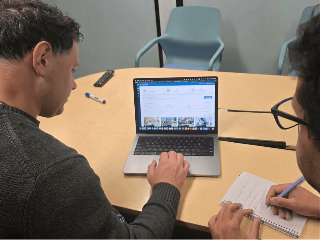
I tested the redesigned proposal flow with four users, including sales staff and real estate agents. Testing revealed that filters were difficult to discover and scan, while some key actions were easy to miss. Based on these findings, I moved filters into a dedicated collapsible panel, repositioned key actions closer to the task and strengthened the hierarchy of primary actions.
Building a stronger foundation for scale and growth
The redesign established a clearer, more consistent foundation across Agent Proposals. It strengthened the product for sales demonstrations, introduced reusable patterns that could scale across the platform, and gave stakeholders confidence to move the new direction into development.
IMPACT 01
Stronger sales proposition
The redesigned experience gave sales teams a more polished and competitive product to demonstrate to prospective customers.
IMPACT 02
A more scalable product
Simplified workflows and reusable patterns created a stronger foundation for future features and product growth.
IMPACT 03
Platform-wide consistency
Patterns established through the redesign could be reused across the wider product, improving consistency and making future experiences easier to design and build.
IMPACT 04
Approved and moving forward
The direction received positive stakeholder feedback, was approved and is currently in development.
Reflection
Redesigning a complex product reinforced the importance of thinking beyond individual screens and looking at the experience as a connected system. Working across 40+ screens meant balancing user needs, business goals and technical constraints while simplifying workflows and creating reusable patterns that could scale across the product.
Interactive Prototype
Explore selected redesigned workflows from MRI Agent Proposals. Some areas are excluded due to confidentiality and access restrictions.
What’s next


MRI ONLOCATION
Safety Check-ins for Lone Workers
Designed a proactive safety experience that helps lone workers confirm their safety, request help and keep responders informed.
8
Client requests
5/5
Positive feedback
0→1
New safety feature
0 TO 1 DESIGN
MOBILE + DESKTOP
INCLUSIVE DESIGN