CROSS-PLATFORM ENTERPRISE SAAS
Redesigning Visitor Pre-registration
I led the end-to-end redesign of MRI OnLocation’s visitor pre-registration experience across web, iOS and Android. The work simplified a fragmented workflow, improved visitor management, and created reusable patterns that scaled across the wider platform.

Overview
Project overview
MRI OnLocation is an enterprise visitor management platform used to manage employees, visitors and contractors across workplaces. As visitor pre-registration expanded to support recurring visits, groups, saved visitors, questionnaires, OnPass and calendar invitations, the experience became increasingly complex and fragmented.
The legacy experience
The existing pre-registration journey was fragmented across multiple steps, entry points and modules. Employees had to create an event before adding visitors, move between separate workflows to complete visitor details and compliance requirements, and return to the visitor list to manage invitations and follow-up actions.

Selected screens showing how the fragmented workflow appeared across the product before the redesign.
My approach
I used the Double Diamond to understand the fragmented visitor pre-registration experience, define the highest-impact problems, explore and iterate on solutions, and validate the final direction before delivery.

Problem
Understanding the problem
As visitor pre-registration expanded to support more enterprise requirements, the experience became increasingly fragmented. Employees had to navigate multiple entry points, workflows and product terminology before completing what should have been a straightforward visitor-registration task.
Research
Understanding the existing experience
I combined stakeholder workshops, journey mapping, product architecture analysis and a UX audit to understand where the existing workflow created friction and identify the highest-impact opportunities for improvement.
Design Workshop
I brought together Product, Engineering, Support and key stakeholders to align customer needs, business goals, operational requirements and technical constraints. The workshop helped establish shared priorities for the redesign.

User Journey Mapping
I mapped the end-to-end visitor pre-registration journey to understand how employees completed the task and where friction occurred. The journey revealed repeated context switching, unclear progression and unnecessary cognitive effort.

Product Architecture Map
I mapped the underlying product architecture to understand why the workflow had become so complex. The analysis showed that navigation and task structure reflected internal product modules rather than the way employees naturally registered visitors.

Opportunity Mapping
I synthesised findings across the visitor journey to identify the opportunities with the greatest potential impact. The clearest direction was to replace disconnected tasks with one connected visitor pre-registration workflow.

UX Audit
I evaluated the existing experience against established usability heuristics to identify the issues with the greatest impact on navigation, interaction and task completion.

Key Research Insight
Problem to Solve
How might we create a connected and modern visitor pre-registration experience that reduces complexity for employees while supporting operational, compliance and business requirements?
Design Strategy
Design
Design Solutions
The following examples highlight the highest-impact design decisions across the experience, showing how the redesign connected fragmented workflows, modernised the interface, and created reusable patterns across web, iOS and Android.
Visitor Registration Entry Point
Created a guided empty state with a clear entry point for both single and group registrations, reducing unnecessary navigation and making it easier to start the right workflow.

Single Visitor Registration Form
Consolidated visitor details, visit information, agreements and questionnaires into one structured form. Recurring options use progressive disclosure to reveal advanced scheduling only when needed, keeping simple registrations focused.


Group Visitor Registration
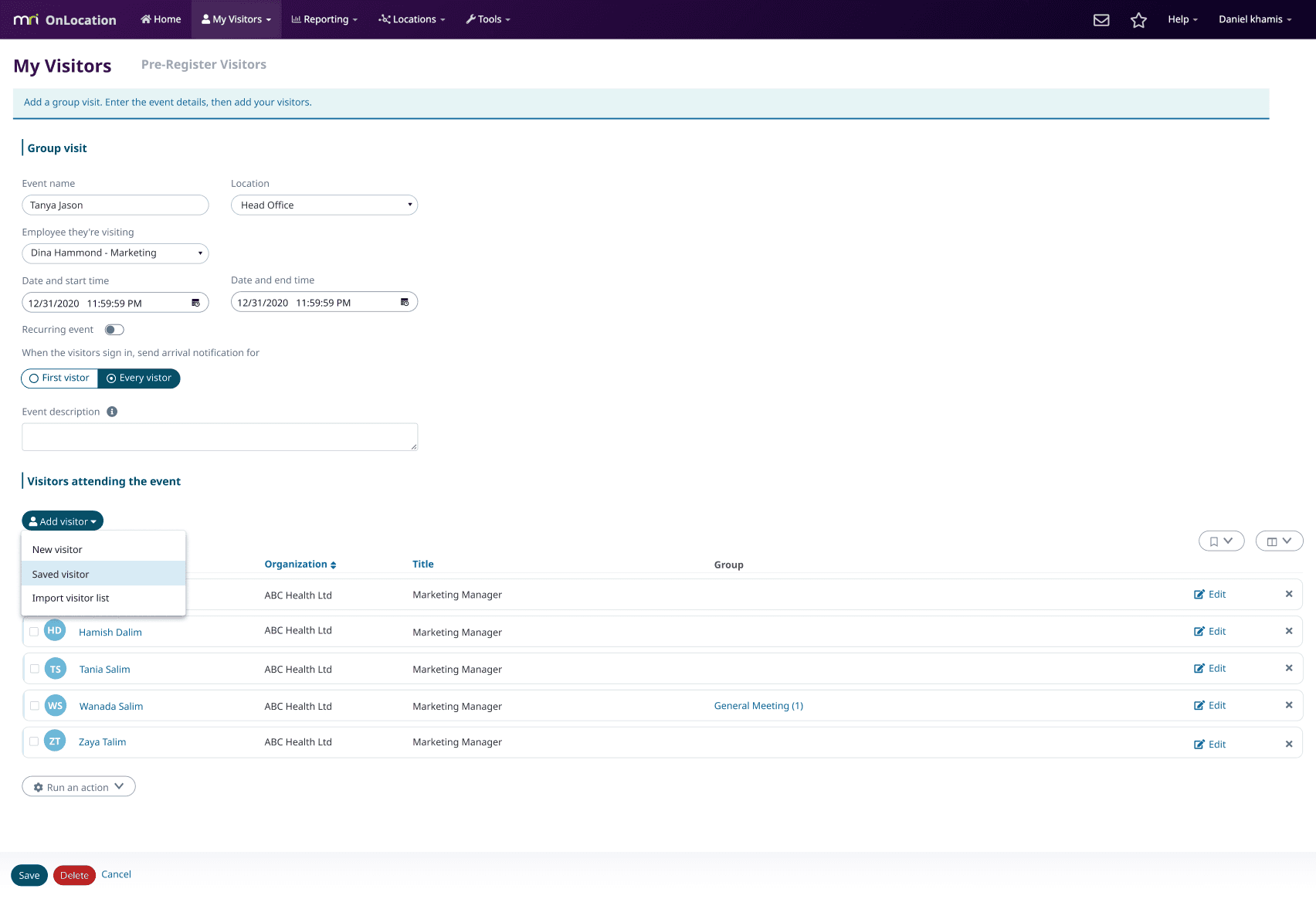
Created a dedicated group-registration workflow that combined event setup and attendee management in one place, making it easier to organise multi-visitor visits and add attendees from different sources without leaving the flow.
Add Saved Visitors or Groups
Introduced a reusable selection dialog that let users search and add saved visitors or groups without leaving the registration flow.

Visitor Management
Redesigned visitor management with clearer filtering and contextual actions, helping users find visitors quickly and manage individual or bulk tasks without cluttering the table.

Status & Group Visibility
Added clearer sign-in/out states, recurring-visit markers and group counts, with info indicators highlighting visitor notes or issues that may need attention.

Visitor Communications
Simplified OnPass and questionnaire communications with clearer sending states and history, helping administrators track what had been sent and what still required action.

Sign-in Experience
Designed sign-in flows for both individual visitors and group events, surfacing the right information, actions and warnings for each scenario.


Calendar Invite Integration
Designed a guided calendar integration that let employees pre-register visitors directly from Outlook or Google Calendar, reducing manual entry and fitting into existing workflows.

Mobile Visitor Registration
Extended visitor pre-registration to iOS with a clear empty state and compact invite flow, making it easy to register visitors on mobile.


Mobile Visitor Management
Created a scannable visitor list and detailed mobile view, helping users quickly review upcoming visits, status and visitor information.


Design Trade-offs & Implementation
The redesign worked within an established front-end framework and existing product patterns. I collaborated with Engineering to simplify workflows and introduce reusable components while balancing usability, technical feasibility and consistency across web, iOS and Android.
Impact
A connected experience across platforms
The redesign shipped across web, iOS and Android, creating a more connected and consistent visitor pre-registration experience while introducing reusable patterns that scaled across the wider OnLocation platform.
Increased engagement
Following the redesign, visitors increased from 3.5k to 13.5k (+287%), page views grew from 30.9k to 258k (+734%), and visitor adoption increased from 27.6% to 40.7%.
Before redesign
After redesign


Recognised as a major product improvement
MRI OnLocation featured the redesign in its quarterly release, highlighting the streamlined single and group registration flows, mobile pre-registration and Calendar Invite integration. The release positioned the new experience as significantly faster and simpler, reducing pre-registration from minutes to seconds.


